Unrivalled quality
In an incredibly short period of time, Dekmantel has managed to establish their Festival at the forefront of qualitative electronic music. Their highly original line-up is truly unmatched.
Setting the look and feel for arguably the most qualitative electronic festival around.
In an incredibly short period of time, Dekmantel has managed to establish their Festival at the forefront of qualitative electronic music. Their highly original line-up is truly unmatched.
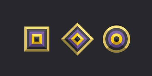
Dekmantel’s pyramid logo and identity formed a great base for us to start from for the 2015 edition. We created a unique new colour scheme, introduced 2 new shapes and added the concept of diagonal folds to enrich the visual language.
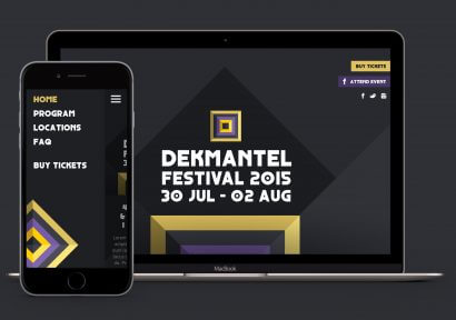
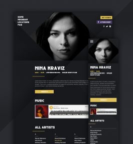
The website we created leans heavily on the diagonal folds concept. Combined with the bold use of the new shapes really gave the website a unique look and feel.
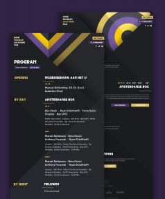
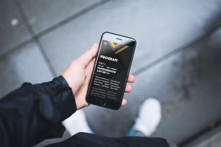
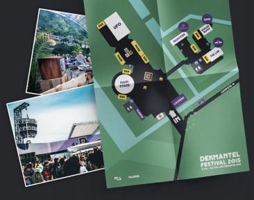
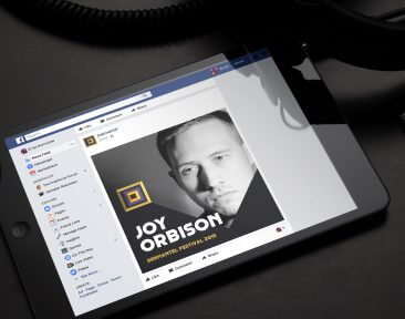
We created a wide spectrum of materials ranging from social posts and posters to timetables and floor plans. The identity was also used in all sorts of festival signage and decoration.
